The Impact of Color in Headshots: How to Use It to Your Advantage
When it comes to headshot photography, every detail matters—pose, lighting, expression, and yes, even color. The colors in your headshot, from your clothing to the background, play a crucial role in how you’re perceived. They can influence the mood of the image, draw attention to your face, and even subtly communicate aspects of your personality or professional identity.
In this blog post, we'll explore the impact of color in headshots and how you can use it to your advantage.
1. Understanding Color Psychology
Colors evoke emotions and convey messages. Understanding the psychology behind colors can help you make intentional choices that align with the image you want to project. Here are some common associations with colors:
Blue: Trustworthy, calm, professional
Red: Confident, energetic, passionate
Green: Balanced, fresh, growth-oriented
Black: Sophisticated, strong, authoritative
White: Pure, clean, approachable
Gray: Neutral, balanced, mature
Yellow: Optimistic, creative, friendly
By understanding these associations, you can select colors that resonate with your professional goals and the impression you want to leave.
Black outfit over the black background in this headshot of a Sarasota real estate agent brings sophistication, strength and authority.
2. Choosing the Right Clothing Colors
Your outfit is a key component of your headshot, and the colors you wear can significantly impact how you’re perceived. Here’s how to choose the right colors:
Consider Your Skin Tone: Certain colors complement specific skin tones better than others. For instance, people with warmer skin tones often look great in earthy colors like browns, oranges, and yellows, while cooler skin tones pop in blues, purples, and emerald greens.
Match the Mood: If you’re in a creative field, you might opt for bold, vibrant colors that showcase your personality. Conversely, professionals in more traditional industries might prefer classic, neutral tones like navy, black, or gray to convey professionalism.
Avoid Distracting Patterns: While color is important, so is simplicity. Solid colors tend to work best in headshots as they keep the focus on your face without distractions.
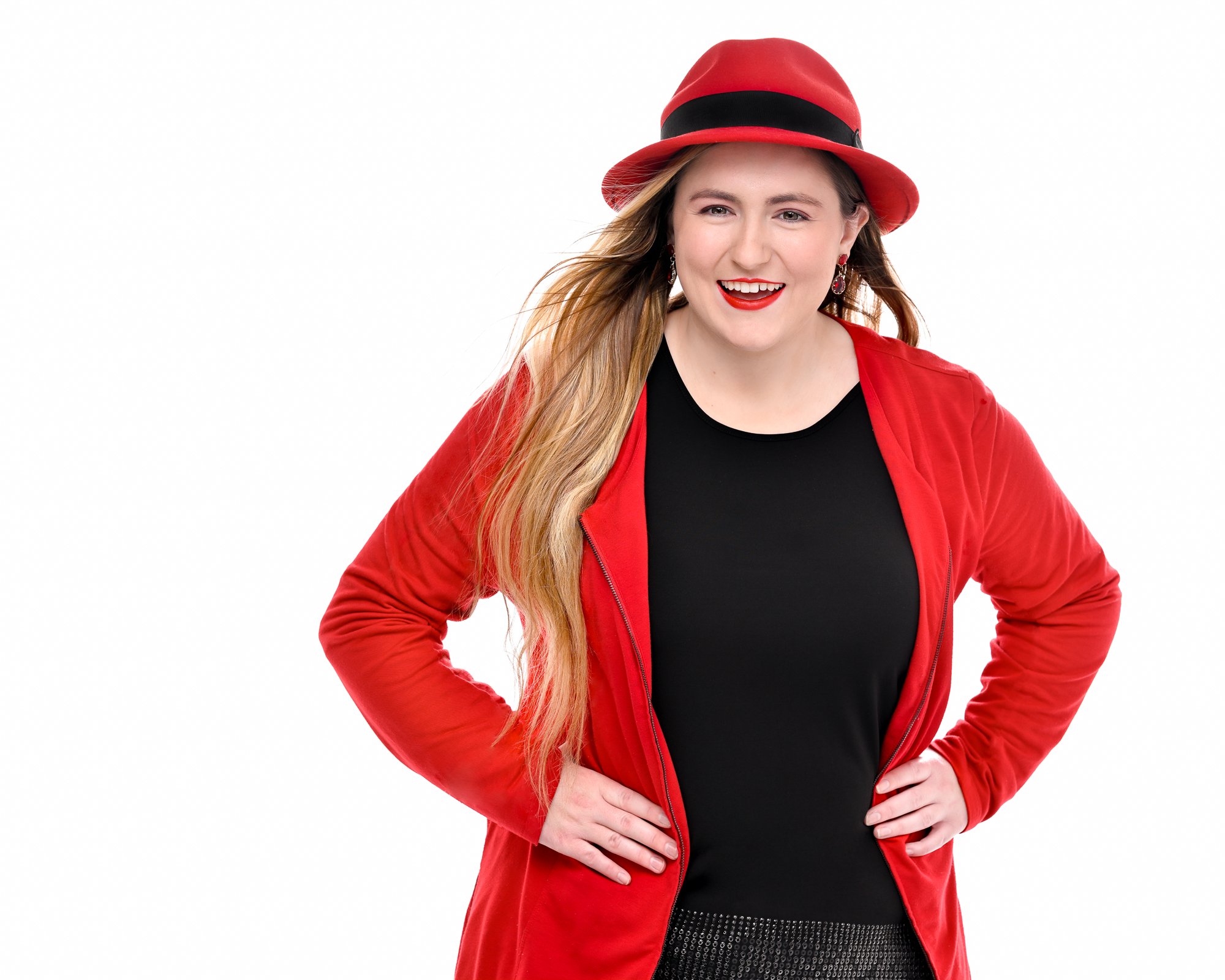
Red color brought confidence, energy and passion to this business portrait of Jacquelyn Daum, the owner and creative behind the Test Flight Studios
3. Background Color and Its Impact
The background color in your headshot can either complement your overall look or create a striking contrast. Here’s how to use it effectively:
Neutral Backgrounds: White, gray, or black backgrounds are classic choices that allow your face and clothing to stand out. They’re ideal for a clean, professional look and work well in various industries.
Colored Backgrounds: If you want to add a bit of personality or match your brand’s color scheme, consider using a colored background. For example, a soft blue or warm beige can create a welcoming, approachable vibe.
Contrasting Colors: Using a background color that contrasts with your outfit can make you pop in the image. For example, if you’re wearing a navy blue suit, a light gray or soft white background can create a sharp, professional look.
4. Coordinating Colors for Brand Consistency
If you’re using your headshot for professional purposes, such as LinkedIn or a company website, it’s important to consider how the colors in your headshot align with your personal or company brand.
Match Your Brand Colors: If your company has specific brand colors, incorporating them into your headshot (either in your clothing or background) can create a cohesive, professional look.
Maintain Consistency: If you’re part of a larger team or company, consider how your headshot will look alongside others. Consistent color choices across team headshots can create a unified brand identity.
5. Editing and Post-Processing: Enhancing Colors
After your headshot session, the editing process allows for further refinement of colors. Here are some ways to enhance color in post-processing:
Color Correction: Ensure that the colors in your headshot are true to life. A slight adjustment in temperature or tint can make your skin tone appear more natural and your clothing colors more vibrant.
Saturation and Contrast: Increasing saturation slightly can make colors pop without making them look unnatural. Adjusting contrast can help define the difference between your clothing and background, ensuring that you stand out.
Retouching: Subtle retouching can smooth out skin tones and reduce any unwanted color casts, ensuring a polished final image.
Conclusion
Color is a powerful tool in headshot photography that can significantly influence the perception of your professional image. By carefully selecting your clothing, background, and considering brand consistency, you can use color to your advantage, creating a headshot that not only looks great but also communicates the right message. Whether you want to convey confidence, creativity, or approachability, the right use of color can help you achieve your goals.
Ready to update your headshot? Contact us today to schedule your session and let us help you choose the perfect colors to make your headshot stand out!
Sylwia Ok is an award-winning Portrait Artist and Master Photographer. She is based out of Sarasota, Florida, and serves families and businesses that are looking for a quality portrait experience.


